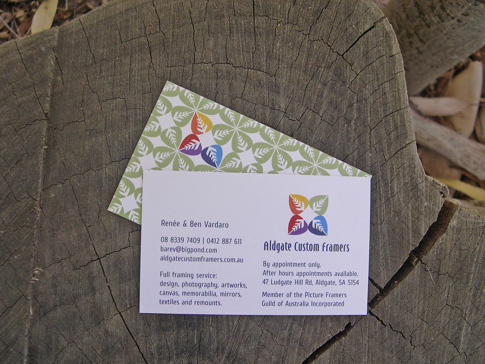
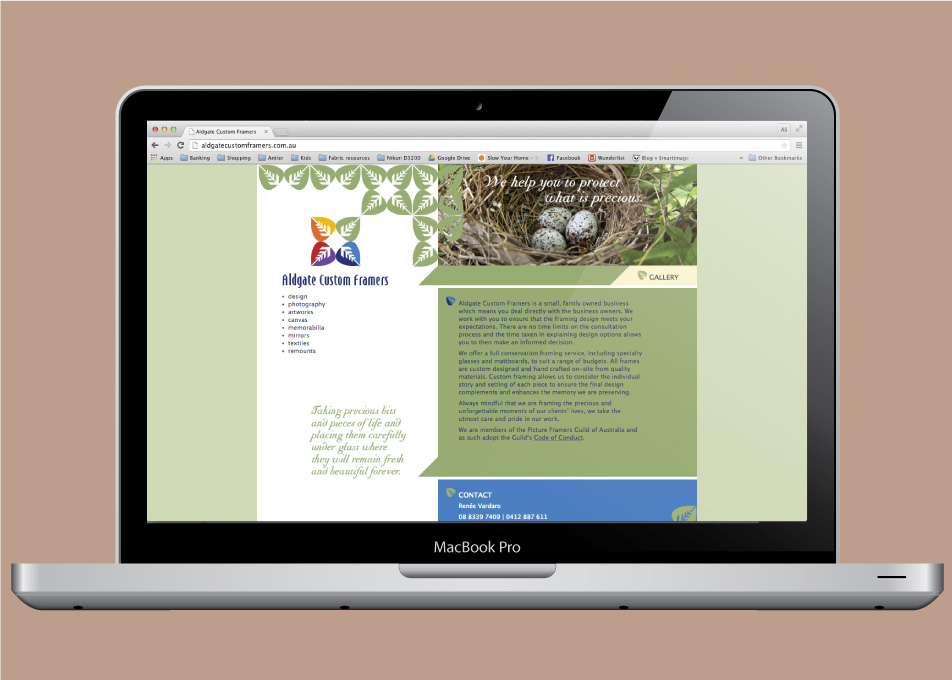
This client came to us with a specific request to include a rainbow of colours in their logo. There are times where we will try to steer a client away from an inappropriate colour request even though it may have a special relevance to them personally. In this case, however, the rainbow of colour represents both the ‘rainbow of choice’ in framing options as well as the extensive variety of items they are able to frame.
Leaf graphics are becoming synonymous with the Adelaide Hills, which is where this business is based. The veins in the leaves are created with arrows the same shape as the framing samples in the showroom and they direct the eye to the centre of the logo – the open space where ‘your’ precious something could be framed and cherished. The logo is very precise and geometric to mimic the precise and accurate nature of the service offered.
This design solution provided the client with a professional and credible image which is so important in a business where customers are trusting you with their treasured items and memories.


